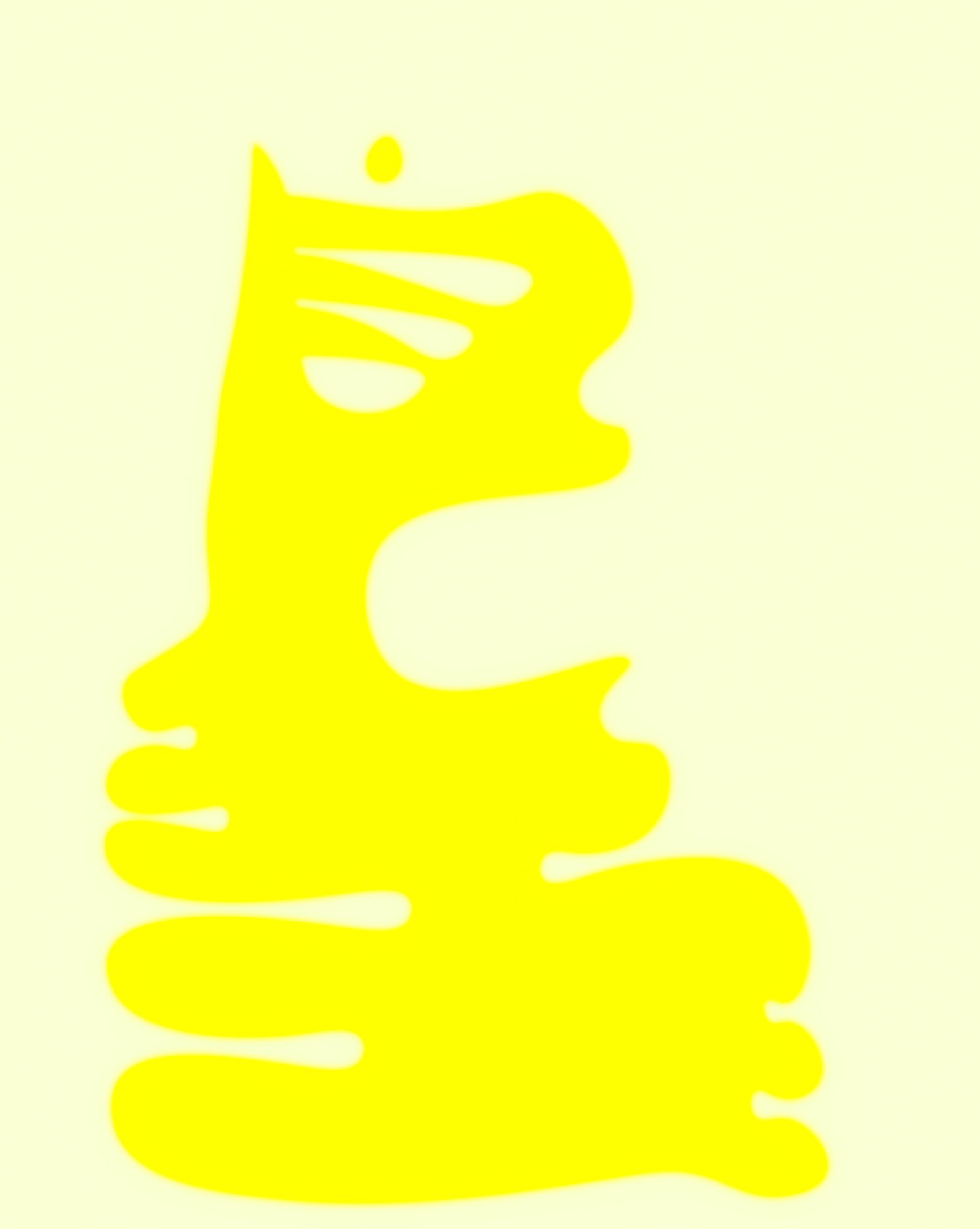
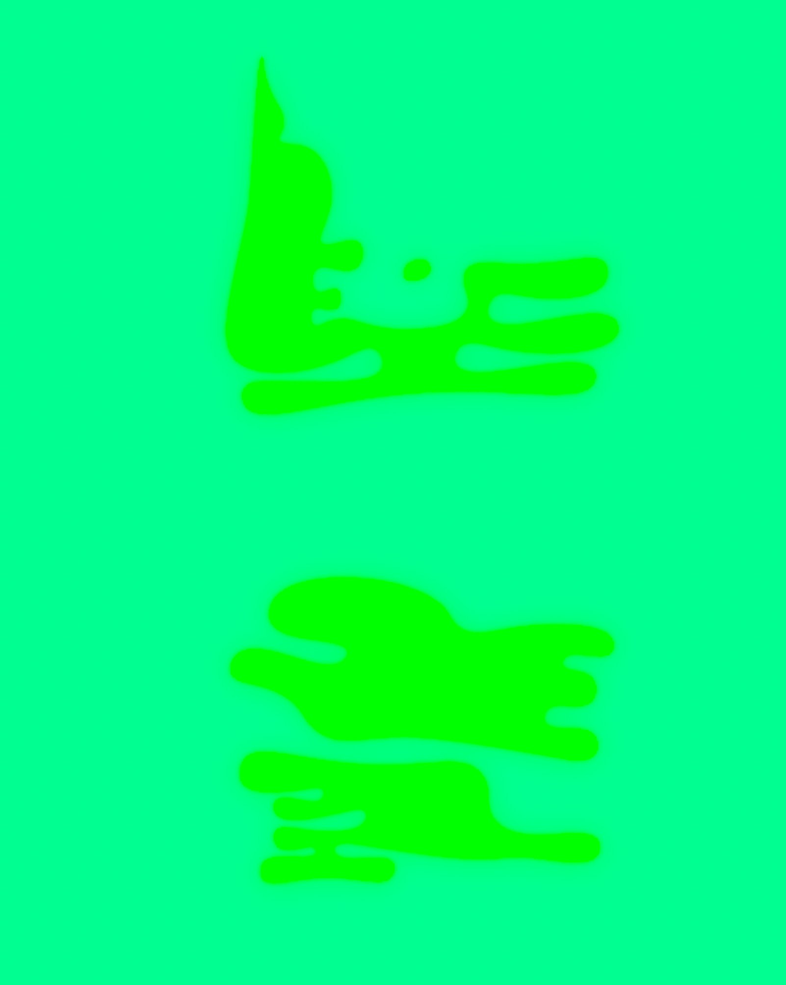
typeface : entrovox
Interview with joey
How did the Entrovox project begin? What made you want to create a typeface from sound?
Like most of my projects, they derive loosely from a previous project. As I was experimenting with spectrograms (pictures of sound) for my Transducing Series, I realized that some sounds had interesting shapes. I always wanted to create my own typeface, so I wondered if it were possible to use spectograms as the basis for a new typeface. I had no idea really if it was going to work. But after some planning, I recorded myself saying the whole alphabet, outlined each letter’s spectogram, then converted that outline to a typeable font. I was excited to make a typeface where the letter’s shapes actually carried meaning, unlike typical typefaces where the shapes are all about aesthetics and only mean something because we assigned it meaning.
-
I’ve never thought of it like that before, but you’re right, letter’s shapes are inherently meaningless until we assign meaning to them. How did Entrovox challenge that idea?
In Entrovox, each letter’s shape carries, roughly, the necessary information to pronounce that letter. So if you had no idea how to pronounce the letters of Entrovox, just by looking at their shapes one could theoretically, with enough effort, realize that the shapes are not arbitrary and could generally formulate the pronunciations of each letter.
Why is it called Entrovox?
The easy answer is that each letter’s dimension is based off of entropy and Vox means voice. I also have have an entirely nerdy answer [laughs], so get ready. The x and y axis dimensions are based on Shannon’s entropy scores of the dynamics, like how loud it is, and sample rate, like the frequency or tone, of the whole alphabet. The tone and loudness of something is how we recognize sound and Shannon’s entropy is really just a calculation for how unpredictable a set of outcomes is, the higher the value to more unpredictable. Shannon’s entropy score for the frequency was 8.665, and volume was 13.449. This comes out to a ratio of 1:1.55. So I used that ratio for the canvas size for the letters. I didn’t want the dimensions to be arbitrary. So the letters convey information about its pronunciation and the dimensions themselves convey the information on the entropy of the sound of the entire alphabet spoken. Fun fact, the widely known golden Ratio is 1:1.618, which is oddly pretty close to 1:1.55. This is either a coincidence or maybe approaching the golden ratio is some sort of optimal ratio for how digital sound works, I don’t know.
It’s crazy how a ratio tied to Shannon’s entropy ends up so close to the golden ratio. Looking ahead, do you see Entrovox as the foundation for other projects or ideas, perhaps exploring new ways to blend sound, shape, and meaning? Is this why it’s called Act I?
Yes! The truth is, Entrovox was just the beginning of a much larger project with three acts. It wasn’t supposed to be an isolated work all on it’s own. Check out Act II next to see where this headed.
A font made from the sound of each letter
A
B
C
D
E
F
G
H
I
J
K
L
M
N
O
P
Q
R
S
T
U
V
W
X
Y
Z


